Skip to content

Archive Edition

COMIC BOOK FIRSTS: VAMPIRELLA

(Edited by Bill Parente; Don Glut, Forrest J Ackerman, Tom Sutton, Frank Frazetta, Billy Graham, and others; WARREN PUBLISHING; September, 1969)

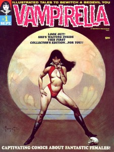
Vampirella 1 cover

In 1969, the world was in flux; it seemed that every day saw some type of major change. Comic books, reflecting those changes, were trying new things just to keep pace. Warren Publishing, the home of horror anthology black and white magazine sized comics CREEPY and EERIE, decided that the sexual revolution was the perfect time and backdrop to introduce a sexy new character, an inhabitant of a planet called Draculon, where blood flows like water… in short, a planet of vampires. I was just short of my eleventh birthday when VAMPIRELLA #1 hit the magazine racks. I was big into comic books and horror stuff and… well… I mean… look at that cover! Of course, I was gonna buy the thing! But, was the rest of the world really ready for a sci-fi vampiric BARBARELLA knock-off? Again, I say, “Look at that cover!” The original series ran for 112 issues, so… yeah, I think that the world was ready for VAMPIRELLA. So, aside from the amazing Frank Frazetta painting on the cover (have I mentioned that cover?), was this thing worth my hard-earned (well, hard-begged for, actually) four bits? Uh… yeah!

VAMPIRELLA #1 ("Vampirella of Draculon" written by FORREST J ACKERMAN, art by TOM SUTTON)
VAMPIRELLA #1 (“Vampirella of Draculon” written by FORREST J ACKERMAN, art by TOM SUTTON)

From front to back, you’ve got some fun horror/thriller/sci-fi type stories, in the same anthology fashion as CREEPY and EERIE – the title character only appears in one actual story and as hostess for the rest of the book. Editor Bill Parente joins Frank Frazetta (who contributes a pen and ink Vampirella… “Vampi” to her friends… that’s every bit as cool as his cover painting) with a welcome from our hostess: “Hi, there! Welcome to the coolest girl-meets-ghoul mag on the market!” Vampi creator (with Trina Robbins) Forrest J Ackerman writes the first tale, “Vampirella of Draculon,” which ostensibly works as an origin for the girl from Draculon. The story is rather short, as such things go – a mere seven pages. The art is provided by Tom Sutton, who’s work is… an acquired taste, to say the least. Actually, to be fair, Sutton became a favorite in the early ’70s with his work on GHOST RIDER, DOCTOR STRANGE, Morbius, the Living Vampire in VAMPIRE TALES and more at Marvel. There’s a whole lot of story and exposition in these seven pages, trying to jam (maybe) too much set-up for Vampi’s arrival on Earth in the next issue.

VAMPIRELLA #1 ("Death Boat" written by DON GLUT, art by BILLY GRAHAM)
VAMPIRELLA #1 (“Death Boat” written by DON GLUT, art by BILLY GRAHAM)

Death Boat” is the first of five (!) stories scripted by Don Glut. It’s a vampire story with a twist, illustrated by the wildly talented Billy Graham (who had a hand in creating LUKE CAGE, HERO FOR HIRE for Marvel Comics). The “shock” ending is a little contrived, but I did mention that Billy Graham drew the thing, right? The next two tales (also by Glut and also featuring twist endings) feature two more of my all-time favorite comics artists: Reed Crandall and Neal Adams.

VAMPIRELLA #1 ("Two Silver Bullets" written by DON GLUT, art by REED CRANDALL)
VAMPIRELLA #1 (“Two Silver Bullets” written by DON GLUT, art by REED CRANDALL)

Two Silver Bullets” is a different take on the “loupe garou” legend. The premise is set in the first panel of the story, as a Canadian trapper’s daughter is attacked by a wolf… a werewolf. Crandall’s artwork has a great woodcut style that was tailor-made for the black and white medium of Warren’s magazines. Throughout his Warren career, some of his best works were those based on the stories of Edgar Allan Poe. By the time VAMPIRELLA #1 hit the stands, Reed had been drawing comics for almost 30 years. That experience definitely shows through the pages of “Two Silver Bullets.”

VAMPIRELLA #1 ("Goddess From the Sea" written by DON GLUT, art by NEAL ADAMS)
VAMPIRELLA #1 (“Goddess From the Sea” written by DON GLUT, art by NEAL ADAMS)

The breadth and power of Neal Adams’ art is certainly on display with “Goddess From the Sea,” more so as the pencil-work is unadorned by the usual India ink “finishes” that comic book readers are accustomed to seeing. The morals to this odd little mermaid story are simple: “Beauty’s only skin deep.” and “You should watch what you wish for… you may just get it!”

VAMPIRELLA #1 ("Last Act: October" written by DON GLUT, art by MIKE ROYER)
VAMPIRELLA #1 (“Last Act: October” written by DON GLUT, art by MIKE ROYER)

Before he became THE inker for Jack Kirby at DC, Mike Royer produced some very nice pages for Warren, including “Last Act: October” in this issue. It’s a tale of revenge, a witch’s curse and the supernatural powers that are unleashed on All Hallow’s Eve. There’s another trick ending here, but it actually works fairly well this time around. “Spaced Out Girls” is a rather bland science-fiction story with artwork by Tony Tallarico (though some sites I’ve visited credit penciller Bill Fraccio with Tallarico inking). The results are… interesting. Writer Nicola Cuti bookends Don Glut’s five scripts with “Room Full of Changes.” The story is strangely confusing… something about a murderous room or some such… but I’ve always liked the unique style of artist Ernie Colon. So there you have it. The stories work better than half the time and the art, for the most part, is off the chart good.

VAMPIRELLA ARCHIVES VOLUME ONE utilizes the original VAMPIRELLA #1 cover painting by FRANK FRAZETTA

VAMPIRELLA #1 has been reprinted – in part or in whole – several times over the ensuing 45 years, the most recent as part of Dynamite Entertainment’s VAMPIRELLA ARCHIVES VOLUME ONE in 2010. The huge (380 pages plus) hardcover features the first seven issues of the original Warren magazine, with additional stories by the likes of: writers Doug Moench and the legendary Gardner F Fox and artists Jeff Jones, Jack Sparling, Dan Adkins and Frank Bolle, among others. For more info on the VAMPIRELLA ARCHIVES series and other Vampi related books, check out www.dynamite.com.

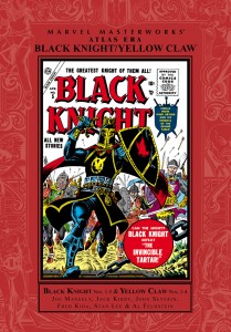
ATLAS ERA BLACK KNIGHT/YELLOW CLAW

(Roy Thomas, foreword/Stan Lee, Al Feldstein, Joe Maneely, Jack Kirby and others; MARVEL PUBLISHING; 256 pages; 2009) A REVIEW FROM THE VAULT

Black Knight Yellow Claw

What we now know as Marvel Comics went through several permutations before they “Made Mine Marvel.” The publishing company started by Martin Goodman started as an outlet for pulp magazines before branching out into comics in 1939, as a way to profit from the popularity of the world’s first super-hero, Superman. The comics wing of Goodman’s “empire” was initially called Timely Comics (with several other companies under the larger umbrella of Timely). In 1951, Goodman hit the reset button as the Golden Age of Comic Book Super-Heroes came to an end, renamed the company Atlas and started throwing every genre of book against the wall to see what would stick. Ten years later, with DC Comics/National Publications again leading the way with a resurgence (and updates) of their super-hero line, Stan Lee and Jack Kirby ushered in the “Marvel Age of Comics” with the premiere issue of FANTASTIC FOUR.

BLACK KNIGHT #3, September 1955 interior panel (artwork by: JOE MANEELY)

Now, Marvel has begun to dip into that deep (if convoluted) history with hardbound reprints of, not only the Golden Age Timely books, but also the Atlas titles that straddled the Golden and Silver Ages. The “throw everything against the wall and let’s see what sticks” attitude of the publisher is certainly on display with this collection, which features the full (and, unfortunately, short) runs of two of the oddest titles ever scheduled by a front-line comics publisher: BLACK KNIGHT (five issues, beginning in 1955) and YELLOW CLAW (four issues, starting the following year). Now, let’s be clear here… “odd” doesn’t necessarily mean bad or unreadable, just… well… odd! And, as you know if you’ve ever picked up a comic book, characters and concepts never really die. The Yellow Claw character (based on Sax Rhomer’s pulp creation, Fu Manchu) made a comeback in the ’60s as a villainous foil for SHIELD and Captain America, among others. Black Knight was reincarnated as a villain (Nathan Garrett, a descendant of the original Knight, Sir Percy of Scandia) in the Giant Man strip in TALES TO ASTONISH, meeting his demise against Iron Man in TALES OF SUSPENSE.Garrett’s nephew, Dane Whitman, took up the mantle, restoring the heroic name by becoming a Defender and, eventually, a member-in-good-standing of the Avengers.

BLACK KNIGHT #1, May 1955 cover (artwork by: JOE MANEELY)

As was the standard during those days, comic books generally consisted of four or five stories with an average length of five pages, as well as a two-page “text” story (to give them some type of legitimacy to “grown-ups,” I assume). BLACK KNIGHT featured three Knight tales, alongside one story featuring a character called “The Crusader.” For the first three issues, every single page was lavishly illustrated by a man affectionately called Atlas’ “workhorse,” Joe Maneely. Maneely brought a depth to the medium that few artists of the day could duplicate. His work appeared in western, horror, science fiction, war, crime, satire and just about every other genre book of the time. And, without exception, each page was more beautiful than the last. He was also on hand for the first issue of YELLOW CLAW, drawing the three Claw stories there, before turning the pencil over to Jack Kirby.

YELLOW CLAW #2, December 1956 cover (artwork by JOHN SEVERIN)

The debut issues of both titles are as famous for the writers (who were rarely given due credit at Atlas) as for the artists, or for that matter, the characters. Joe Maneely always signed the splash panel of his work and, if you check closely on BLACK KNIGHT #1, you’ll see that someone else signed his name above: Stan Lee. Before comics began printing full credits, Stan was making a name for himself by letting the reader know who was responsible for what they were reading. Check out some of those Atlas monster books: Stan’s name is right there with Ditko, Ayers and Kirby (and sometimes, if the artist didn’t sign, Stan’s was the only name there). YELLOW CLAW #1 was written by Al Feldstein, a writer and artist from the glory days of EC Comics. His stories were always dark and didn’t always have a happy ending. This made the menace of the Claw’s character almost palpable and the chance that evil would ultimately triumph over good a very real possibility. Where the Black Knight stories dealt with the Arthurian legends of Camelot and the Knights of the Round Table, Yellow Claw walked a fine line between horror and Cold War espionage (leaning heavily on the latter in the first issue). So… enough of the preliminaries, eh? Let’s get into the specifics about this MARVEL MASTERWORKS edition.

BLACK KNIGHT #3, September 1955 interior splash page (artwork by: JOE MANEELY)

The first part of the book (after an insightful and entertaining foreword by the legendary comic book creator, Roy Thomas) covers BLACK KNIGHT. The Knight tales are enjoyable stories filled with swords and sorcery, lances and horses and, of course, damsels in distress. In the first story (a long, 10-page origin story), Sir Percy is chosen by King Arthur’s confidant and mage, Merlin, to become the Black Knight, a protector of King and Realm. Every good hero should have a secret identity and the Knight is no exception. In true Clark Kent fashion, Percy is portrayed as a somewhat bumbling coward. His appearance at Court is more of a foppish boob than anything else, allowing himself to be laughed at and pushed around by the evil Mordred and his loyal minions. Of course, the Knight proves his worth in battle against the evil Mordred and is knighted by Arthur. In the second story (this one runs eight pages), the Knight’s sword is empowered by the magic of Merlin… as long as he wields the “Black Blade” only in service of the King. The third story is an origin story of sorts for the Crusader, a character fighting the Saracens in the Holy Land during… what else?… the Crusades. While the length (five pages) doesn’t allow much in the way of character development or plot (or action, or story or a whole lot of anything else), it does kinda whet the appetite for future installments.

BLACK KNIGHT #4, November 1955 interior splash page for The Crusader (artwork by: JOHN ROMITA)

With issue number two, the stories return to the mean… nothing spectacular outside of the beautiful Maneely artwork. Each issue now features three 6-page Knight tales plus the five-page Crusader piece. For what it’s worth, the Crusader, with its continuing storyline, offers a bit more with each new episode. Does this mean that Stan Lee was only responsible for penning the first issue? It would seem to be the case, even though he may have stayed around for the Crusader. I bring up that possibility only because of the linear story-telling throughout the series’ run. By the fourth issue, Joe Maneely was gone. The Black Knight stories were now illustrated by Fred Kida; the Crusader has some great, stylized work from John Romita. Kida’s art is actually pretty good; his shortcoming – compared to Maneely – is more in composition and layout. Romita is… well… Romita! Number five has another new artist, Syd Shores. Again, Syd’s work is serviceable, maybe a step or two down from Kida. Part of the problem could be – at least on the Knight stories – is the fact that another artist, Christopher Rule, inked Shores’ pencils. On the Crusader, Syd inked himself and attempted to maintain the more stylish work of Romita’s story from the previous issue.

YELLOW CLAW #1, October 1956 interior splash page (artwork by: JOE MANEELY)

YELLOW CLAW is a completely different beast but, you find yourself immediately drawn in by that beautiful Joe Maneely art. The Yellow Claw is a 150 year old – possibly other-worldly (check the pointy ears) – scientific genius with great powers of suggestion. For whatever reason, he has a mad on for the good ol’ US of… and, seeking to overthrow all of Western civilization, comes up against FBI operative Jimmy Woo. A warning for the Politically Correct among you: all of the Asian and German (the Claw’s second-in-command is a Nazi war criminal) characters are stereotypical 1950s depictions; my suggestion: Get over it and enjoy these stories for what they are. What they are, at least in the first issue, is Cold War spy stuff with the Communists looking for ways to gain control of the American government, utilizing the nefarious Claw and his minions to accomplish that goal. The fact that they also have supernatural elements – due, no doubt, to Al Feldstein’s creative writing – only adds to the fun. The first issue features three Yellow Claw/Jimmy Woo stories (two 6-pagers and one 7-pager) and an unrelated four-page “foreign intrigue” tale, with art by Werner Roth.

YELLOW CLAW #4, April 1957 interior splash page (artwork by: JACK KIRBY, pencils and JOHN SEVERIN, inks)

If the entire concept of YELLOW CLAW was something completely different, the final three issues were something else altogether. Before the second installment of the book came out, Feldstein was offered and accepted the editorial reins of EC’s MAD, leading to the entire creative team being replaced by the immortal Jack Kirby. Now, for me, Kirby has always been hit and miss… especially his writing (I enjoyed a lot of his 1970s DC Comics stuff, particularly THE DEMON, but could not get behind his run on the Losers). Anyway, Kirby quickly turned the series in a more sci-fi direction. The stories were shorter (the second issue featured three 5-page tales and one 4-page piece), the art panels larger (partially to highlight Kirby’s pencil work, partially – and this is conjecture on my part – to hide his script-writing shortcomings) and the stereotypes intensified. “Footsteps In the Dark” is a four page stand-alone, totally uncredited spy story that kinda sticks out amidst the over-the-top Kirby pages. The final two issues follow suit, page-wise. The non-Claw tales are, respectively, “The Trap” (art by George Roussos) and “The Locked Room” (with weird, Ditko-like art from Manny Stallman). What may have been an attempt to rein in Kirby’s bizarre style resulted in the final issue being inked by John Severin. In my humble opinion, inking Kirby’s pencils takes a special type of artist; these artists are few and far between… Vince Coletta on Thor and Mike Royer on a lot of his ’70s DC output come to mind. Severin over Kirby was an absolutely genius pairing. Unfortunately, I think this may be the only time this combination worked together. As a bonus to Severin fans, he was also responsible (pencils and inks) for the covers of issues two and four. Sub-Mariner creator Bill Everett produced a beautiful cover for number three, by the way.

Artist Joe Maneely, circa 1945 (uncredited photo)

As the incredible artwork of Joe Maneely served as a focal point to this collection, there is also a 12-page essay by comics historian, Doctor Michael J Vassallo, called “Joe Maneely: Adventure Comics,” as business cards for Maneely’s studio were printed. It is an in-depth examination of the man, his work and his life, which was cut far too short, at the age of 32, in a 1958 commuter train accident. His is one of the great “What if… ” stories in Marvel Comics history. Add this special feature to the nine issues worth of comics and this is definitely a collection worth owning.

ROY THOMAS PRESENTS CLASSIC PHANTOM LADY, VOLUME 1

(Roy Thomas, foreword/Joe Kubert, Matt Baker and others; 301 pages; PS ARTBOOKS/PS PUBLISHING, 2013)

Phantom Lady

Most of us who grew up in the ’60s and ’70s may remember Phantom Lady from the DC comic series JUSTICE LEAGUE OF AMERICA (DC acquired the Lady and many such properties from Fawcett, Quality and many other minor publishing houses- including the Captain Marvel Family from Fawcett, and Plastic Man and Phantom Lady from Quality). In a story featuring the Justice Society of America, the two teams travel to Earth X, where the Nazis won World War II and several Quality heroes have banded together, calling themselves the Freedom Fighters. Now, thanks to comics legend and historian Roy Thomas, what we have here is the first stories to feature Phantom Lady, including her entire run in Quality’s POLICE COMICS, starting with the August 1941 debut issue and ending with #23, dated October, 1943. There are also three cross-over stories (quite rare for the time) from FEATURE COMICS and starring the Spider Widow and the Raven. After POLICE COMICS #23, Phantom Lady just disappeared. She was revived by Fox Features in her own title, cover dated August, 1947, with numbering starting at #13 (taking over numbering from WOTALIFE COMICS). The first five issues of the revival are here, as well. That, my friends, may seem like a WHOLE lot of comics. And it is… just not a particularly large page count. Most of the Quality stories are only six pages long (a few are five), which is certainly problematic from a story-telling standpoint. But, more of that later.

Spoiled society debutante Sandra Knight, as Phantom Lady, works the spy and military espionage cases in Washington, DC, where her father, Senator Henry Knight, seems to be very much involved in whatever particular Senate Sub-Committee that has anything – no matter how remote – to do with the Lady’s current case. Phantom Lady’s mysterious work is, amazingly, accomplished in a skimpy swimsuit (that would have gotten her arrested in most towns and cities back then), a bright green cape, and… with very few exceptions, no mask! The latter had to be a real pain because a majority of her early stories involved her saving either her father or her boyfriend, Don Borden (of the State Department, no less), or – more often than not – both of them, from some unusually inept fifth column threat or scheme. I mean, even Superman’s alter ego wears glasses and a different hair style. Sandra’s answers to the usual coming and going questions (“Where are you going at a time like this?” and “Where were you? Phantom Lady saved us all!”), likewise, would have made even Clark Kent cringe (“Oh… I forgot I was out of lipstick and had to buy some before someone saw me without any.” or “I thought I heard the cat meowing for a saucer of milk, so I went to berate the staff for not taking care of such problems before they came up.” Okay, so those two are mine, but the excuses actually used in the stories are equally lame.). Sandra’s feigned self-absorption certainly did take the art form to new levels of narcissism… much like the very real spoiled pop tarts and tabloid princesses of today.

With only six pages of story, the writers (whose names are lost to the pages of time, by the way) were really hampered. As the strip was action-oriented, the basic premise of the plot had to be delivered in the first several panels; someone had to be kidnapped or threatened in the first two pages; the Phantom Lady had to find the bad guys’ hideout and come close to being permanently eliminated before bringing out her weapon of choice (a black light which caused her enemies to be blinded if they fell within its range) to wrap up the crooks before the bottom of page five; the cops had to be notified and Sandra Knight had to make her reappearance – usually uttering some snarky remark – before the end of the story. Formulaic? Sure, but – as they say – those were simpler times and the writers were basically writing these things for kids. They did try to imbue the scripts with a touch of humor… usually unsuccessfully. In fact, the only time that the humor really worked well was during the cross-over stories featuring the Raven and Spider Widow. These stories also worked because there was a common plot device running through the five stories (two in POLICE COMICS, three in FEATURE COMICS): Competition. The two heroines were chagrined that the other claimed to be the most popular female hero in comics, fighting each other as much as the villain of the piece. Of course, stuck in the middle was Spider Widow’s partner, the Raven.

Things were allowed to progress at a slower – if not more natural – pace with the Fox Features stories. The Lady was featured in stories that ran from seven pages (I know… not much of an improvement, but… ) to eleven or 12 pages, with two (and, in issue #14, three) stories per issue. Though these stories were no less formulaic, they were better fleshed out than the Quality stories. They also featured a more common class of criminals, as well, as Phantom Lady became more involved in diamond robberies and the like. She even confronted zombies in “An Army of Walking Dead” in issue #15 and a werewolf in a story called “The Monster In the Pool,” from issue #16.

POLICE COMICS #15 "The School For Spies" page 3 (art by JOE KUBERT)
POLICE COMICS #15 “The School For Spies” page 3 (art by JOE KUBERT)

The real story here is the artwork. That pun, by the way, was fully intended. The first 13 stories were drawn by Arthur F Peddy. Peddy’s style, at first, reminded me of Charles Moulton’s early Wonder Woman stories. As the series progressed, he became more comfortable with the female form and Phantom Lady’s appearance and movements took on a more natural look. The real find from the Quality era begins with “The West Point Incident,” from POLICE COMICS #14. That story and the next two were illustrated by a very young Joe Kubert. Looking at these 18 formative pages, we see only a slight glimmer of the style that Kubert would perfect in the ’50s and ’60s at DC. Instead, we have a very Eisner-esque style that works very well with the super-hero strip. Two of the Kubert stories feature an odd, though somehow appealing veil-like mask on our heroine. Starting with POLICE COMICS #17, Frank Borth takes over and it seems that the Lady finally has the perfect artist. There is some conjecture that Borth may have also written these tales, as they are credited as “A Frank M Borth Feature.” The three Spider Widow stories are credited the same and he is also listed in the contents pages of this collection as being the writer of those scripts. Borth, like Kubert, tries a mask – a simple black mask that covers the eyes (think Robin or Zorro) – for the Lady. It lasts for one story and is retired. The art on the final two POLICE COMICS stories are credited to Rudy Palais (the contents has a question mark beside his name for issue 22, the story from issue 23 is signed). Again, Palais seems to be a step up (although only slightly) from the previous artist.

PHANTOM LADY #13 "Knights of the Crooked Cross" splash page (art by MATT BAKER)
PHANTOM LADY #13 “Knights of the Crooked Cross” splash page (art by MATT BAKER)

The first Fox Features stories brought more changes than just the page count. Gone were the yellow swimsuit and green cape, replaced by a more appealing blue suit (and blue shorts) and a red cape. Sandra Knight/Phantom Lady was also now more voluptuous than her Quality artists drew her. Fox was cashing in on what has come to be known as “Good Girl” art, a style that many critics of the day considered borderline pornographic. These artistic changes were provided by Matt Baker, a young man who obviously knew his way around the female of the species. His was a style that would be very much in demand at the major comics houses today, very clean and detailed. These five issues alone would be worth the price of this collection. The Fox Features stories were credited to “Gregory Page,” a pseudonym used throughout the Fox line. Mister Thomas, comics scholar that he is, believes that these scripts were actually written by Ruth Roche. Me… I just read ’em, so I bow to his superior knowledge. Roy promises more Baker and Roche in Volume 2 of this collection. I can’t wait!

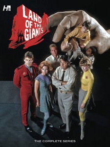
LAND OF THE GIANTS – THE COMPLETE SERIES

(Tom Gill and others; 175 pages; HERMES PRESS, 2010)

landofthegiants_large

Before he became the Cecil B DeMille of disaster movies (THE POSEIDON ADVENTURE, THE TOWERING INFERNO and many more), Irwin Allen was the Sherwood Schwartz of television sci-fi and fantasy adventure. Allen was the producer and creative force behind such TV fare as VOYAGE TO THE BOTTOM OF THE SEA, THE TIME TUNNEL and what was probably the crowning achievement (it was definitely the most fun to watch!) of his small-screen output, LOST IN SPACE. For two seasons (1968-1970), one of the most ambitious series to date, ABC’s LAND OF THE GIANTS, battled LASSIE and THE WONDERFUL WORLD OF DISNEY (perennial powerhouses for, respectively, CBS and NBC) for early Sunday evening television supremacy. It was, at the time, the most expensively produced program on TV, costing a whopping $250,000 per episode. With it costing so much to produce and considering the formidable competition, it is a wonder that it lasted as long as it did!

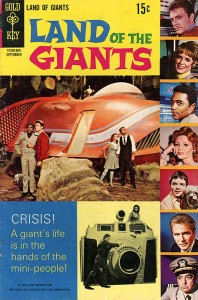
LAND OF THE GIANTS #5 cover

As with Allen’s other shows (and some of his films, as well), Gold Key Comics published a tie-in book for LAND OF THE GIANTS. Unlike the TV show, the comic version was only around for 10 months – long enough to produce five issues of ultra-sanitized (Gold Key was probably the most family-friendly comics publisher on the market) stories. Now, Hermes Press has digitally spruced up those old pages (with a few extras to flesh out the page count) and put them in a nice looking hardcover collection for all of us nostalgia lovers.

So… here’s the premise: It’s the future (1983) and a passenger ship (Allen’s version of the SS Minnow), with seven people on-board, end up on a world where they are only six inches tall. Whether they were shrunk to that size or if they remained regular-sized and the inhabitants of the planet truly are giants, I was never really sure of. Anyway, you’ve got the crew of the Spindrift (there’s a name that elicits confidence, huh?) – pilot, co-pilot and a stewardess prone to hysterics – a self-absorbed society girl, a super-smart-guy type, a sniveling, unscrupulous type (think LOST IN SPACE’s Doctor Smith… only less) and, naturally, a boy and his dog. They’re confronted by the usual misguided guest stars (you know… well-meaning or merely curious folk, lonely kids, big-brain scientists who see them as an experiment) and down-right mean guest stars (you know… criminals who want to use them in some get rich scheme, lonely kids, big-brain scientists who see them as an experiment). Of course, the dangers weren’t always what you’d expect. Sometimes, just surviving in a well-manicured park lawn could be as dangerous and terrifying as traversing on foot and unarmed a jungle filled with wild beaties; a mud puddle would seem like an ocean when you’ve got to cross it to get home. You get the idea.

LAND OF THE GIANTS #5, page 15 (Art by Tom Gill)

The stories collected here follow suit and aren’t brain-achingly difficult to decipher. Nor are they intensely stooge-like in their simplicity. Yeah… the scripts (most likely written by Paul S Newman) may be overly predictable, but they still manage to be engaging in fun way. Likewise, the artwork isn’t spectacular in a Neal Adams or Gil Kane way, but it is servicable. Tom Gill’s style is clean and very much to-the-point. Gill was a mainstay at Dell and Gold Key for years and years. He and Newman had a 107-issue run of Dell’s LONE RANGER book and Tom illustrated stories for BONANZA, THE TWILIGHT ZONE and many others for Gold Key. He once said that he would only produce two pages of comic art per day, which isn’t a lot. That is indicative of how seriously he took his craft. My sole complaint with his LAND OF THE GIANTS work is that – virtually from panel to panel – the main characters’ appearance change from resembling the actors portraying them in the TV series to something almost unrecognizable. While it is annoying, it certainly didn’t keep me from enjoying this book as a whole. I’m sure you’ll agree.

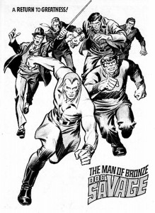
SHOWCASE PRESENTS DOC SAVAGE

(Doug Moench and Various; 448 pages; DC COMICS, 2011)

Showcase Doc Savage

Publisher Henry W Ralston with an assist from editor John L Nanovic (they of publishing house Street and Smith) created what was, for all intents and purpose, the first “super” hero, Doc Savage. Lester Dent brought the character to life in the pages of DOC SAVAGE MAGAZINE beginning in 1933. Since then, Doc and his aides (later to be dubbed the Fabulous Five) have appeared in just about every medium imaginable: radio, film, several reprint series in book form (Bantam Books began publishing paperback versions in 1966) and, of course, comic books (there were even two attempts to launch daily newspaper comic strips, the first written by Dent).

DOC SAVAGE #1 (intro page by JOHN ROMITA and TONY DEZUNIGA)

From 1975 through 1977, Marvel Comics printed an out-size black and white magazine version of their moderately successful color book. Both the books were canceled in 1977, Marvel having lost the comic book publishing rights to the character. DC Comics obtained the comic book rights in 2010, no doubt smelling the same kind of money that Marvel sniffed in the ’70s: a movie tie-in! Though the movie is still in production, DC went ahead with several titles starring Doc (a one-shot with Batman, a mini-series called FIRST WAVE and his own title, which lasted ’til mid-2012). Apparently, the publishing rights included previous comic book versions, including the ’70s Marvel books. And so, here we are, examining this SHOWCASE PRESENTS… collection of the eight-issue black and white series.

I remember buying these mags (and the color book, too) back in the day when I bought everything with a Marvel or DC logo on it. I bought, but very rarely read. Sure, I gave a cursory look at the innards of the books, perusing the art and scanning the word balloons for the mere basic plot, but I almost never read an entire issue of anything outside THE AVENGERS or TOMB OF DRACULA. Okay… that was a long-winded way of me telling you that though I’m familiar with the material, this is the first time I’ve actually read the things from front to back. I gotta say that, for the most part, I like what I’m reading. The artwork is all over the place, with most of it tied together by the inks of Tony DeZuniga, whose guazy, thin-lined approach was much in demand at DC (where, as both penciller and inker, he co-created Jonah Hex with writer John Albano) through-out the 1970s. He, obviously, also did a smattering of work for Marvel.

DOC SAVAGE #5, page 14, panel 3 (script by DOUG MOENCH, artwork by TONY DEZUNIGA)

Doug Moench, who got his start in the 1960s at Warren Publishing (doing horror for CREEPY, EERIE and VAMPIRELLA) and created the Deathlok and Moon Knight characters while at Marvel, wrote the stories. They were all originals featuring Doc and other characters created in the ’30s and ’40s by Lester Dent or his surrogates. Moench’s work is faithful to the pulp adventures and are generally fun to read. He was given the chance to develop character and plot a little bit more than a standard 20 page comic, as most of the stories are over 50 pages in length. My favorite of the nine yarns presented here is the second, “Hell-Reapers At the Heart of Paradise.” Featuring Vikings, pirates, a mysterious blond and a cavern at the center of the Earth inhabited by ticked-off lizard people, and great art with pencils and inks by DeZuniga, what’s not to love? Other highlights include the John Buscema-drawn (except for, oddly, one page penciled by John Romita) first issue feature, “ The Doom On Thunder Isle”; “A Most Singular Writ of Habeas Corpus,” a solo tale from issue #3 featuring Doc’s specialist in chemistry, Andrew Blodgett Mayfair (Monk, as the others call him), with art by Rico Rival; and “The Mayan Mutations,” again featuring the art of Tony DeZuniga, from issue #7. While DeZuniga is responsible for most of the artwork, there are others who contribute, some more admirably than others. Buscema returns for the lead story in #3, the wonderful Marie Severin pencils the first eight pages of “Ghost-Pirates From the Beyond” for the fourth issue, and the usually solid Ernie Chan offers a less-than-stellar job on the final issue’s tale, “The Crimson Plague.” Chan’s art isn’t offensive enough to totally wreck the story, though, as it holds up as well as the others.

I am a huge fan of DC’s SHOWCASE PRESENTS… archival reprint series. The books, while all are printed in black and white, are almost all over 500 pages and offer a chronological look at most of the strips from the Silver (and a few from the Bronze) Age of DC Comics. They are a great way to collect some old favorites or familiarize yourself with titles and characters you may not recognize. Reprint agreements between DC and the writers and artists in later years has, unfortunately, rendered some titles unavailable but – I’ll take what I can get… they are that good! This one, though, is a bit odd since they were originally published by Marvel, is no exception.

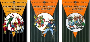
THE SEVEN SOLDIERS OF VICTORY ARCHIVES

(Volume 1; 237 pages; DC ARCHIVE EDITIONS, 2005) (Volume 2; 228 pages; DC ARCHIVE EDITIONS, 2007) (Volume 3; 288 pages; DC ARCHIVE EDITIONS, 2008)

Seven Soldiers covers

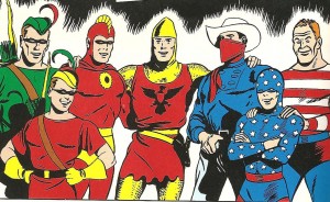
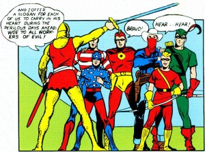
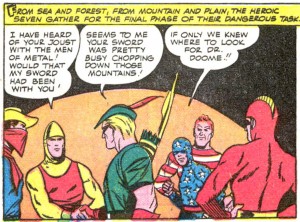
For 14 glorious issues of a book called LEADING COMICS (published between 1941-1945), eight (!) marginal heroes from the popular anthology books published by National Periodicals (part of DC Comics, home of Superman, Batman and Wonder Woman) were featured in some of the strangest and most exciting adventures of their time. Like the only other super-hero team of the era (DC’s popular Justice Society of America), the stories were basically solo adventures starring the respective members. The catch with the Soldiers (alternately called “Law’s Legionnaires”) was that, rather than meeting on a regular basis to recount individual heroic feats to their colleagues, they were brought together by a common foe, separated to handle particular aspects of the case best suited to each individual’s abilities and came back together for the ultimate defeat of the villain (or villains).

Another, more unique aspect of the team was the fact that, while all were superb physical specimens and each possessed quite analytical minds, they had no super powers. Green Arrow and his young partner, Speedy (appearing regularly in MORE FUN COMICS), perhaps the most well-known of the eight, were expert marksmen with the bow, often using trick arrows to stymie their opponents; the Vigilante (from the pages ACTION COMICS), a motorcycle riding ex-singing cowboy radio star was as adept with a lasso as he was with a six-shooter; the Crimson Avenger, along with his partner, Wing, the unofficial eighth Soldier (the character with the longest comics pedigree, as a back-up in DETECTIVE COMICS) wasn’t afraid of a dust-up, but preferred to use his brain before his brawn to out-think the bad guys; rich kid Sylvester Pemberton and his chauffeur, Pat Dugan, better known as the Star-Spangled Kid and Stripesy (who held sway in – where else? – STAR-SPANGLED COMICS) used expensive gadgets and Pat’s muscles; Sir Justin, the Shining Knight (appearing in the pages of ADVENTURE COMICS), was exactly what the name implies – a valiant knight of Arthur’s fabled Round Table displaced in time. Aside from the Knight’s magical sword, the only “super-powered” being in the entire lot, in fact, was Sir Justin’s winged horse.

Leading Comics #1, page 1 (art by George Papp)

The stories, the early ones mostly written by Mort Weisinger (with helping hands from Jerry Siegel, Bill Finger and the seemingly ever-present “Unknown”), were always long on action and fairly short on plot. That really didn’t matter then and, truly, it’s not too much of an issue now… other than the occasional moan-inducing plot device or the cringe-worthy characterizations of various ethnicities. If you are one of those easily offended PC types, any comic produced before the 1970s probably isn’t for you. Real people, on the other hand, recognize these books for what they are: historical reference points in the growth of the country’s march toward racial equality and tolerance. To say that such things shouldn’t be readily available is to say that things like discrimination (in all of its nasty forms), war, and racial strife are better off forgotten… treated as if they never existed. That, my friends, is where the famous axiom, “Those who do not remember are doomed to repeat,” comes into play. Sure, the portrayal of the Avenger’s “Oriental” sidekick, Wing, is overly stereotypical of the way Asians were viewed in the ’40s, but that doesn’t (or shouldn’t) have an adverse affect on your enjoyment of these classic comics. Remember, the same things were happening in all entertainment mediums – from radio to film and beyond. Some of the movies and novels of the day are considered classics, even though they offered stereotypical views of Blacks, Jews, Germans and, often, women.

Leading Comics #1, page 5 (script by Mort Weisinger, art by George Papp)

Okay, stepping down from the pulpit, let’s get back to the Seven Soldiers series. The first three issues of LEADING COMICS featured a different artist for each chapter, usually the character’s regular artist in their other appearances. George Papp drew all three Green Arrow chapters, as well as the wrap-around Soldiers chapters in the first issue’s story, “Blueprint For Crime.” Papp was a jobber… dependable, but not overly adventurous in his lay-out or execution. The Star-Spangled Kid’s chapters were handled by Hal Sherman. Let’s just say that his work was definitely an acquired taste – one I’m not certain that I will ever acquire. Sherman moves the story along, though, as he must. Jack Lehti, a cut or two above Hal Sherman talent-wise (though with more imaginative lay-outs), took care of the chapters starring the Crimson Avenger. Creig Flessel drew the Shining Knight chapters with a certain panache, an airiness that made his work seem a step above the norm. Though more adventurous than George Papp, his work – like Papp’s – was enjoyable and dependable. Mort Meskin drew four of the first five covers for LEADING COMICS, as well as the first three Vigilante chapters and the wrap-around chapters for numbers 2 and 3. Meskin’s work was stylized and unique, offering a – dare I say? – a Kirbyesque quality in lay-out and body structure and positioning. His Vigilante is the definite highlight of the first three issues and his cover for issue number 4 is certainly one of the best you’ll see.

Leading Comics #4 (cover art by Mort Meskin)

Change was afoot with issue 4, as Bill Finger scripted the entire thing, called “The Sense Master.” Artist Ed Dobrotka dipped his pen in the inkwell on page one and didn’t let up until the final page. As I’m not the comics historian that someone like Roy Thomas is, I can’t say this with utmost certainty, but this could mark the first time that one artist was responsible for an entire 56 page comic book. Falling somewhere between Jack Lehti and George Papp talent-wise, Dobrotka’s work was serviceable and gave the story a nice sense of continuity from chapter to chapter. These first four issue make up the first volume of this archive series, with issues 5-8 filling up volume two and the final six issues (9-14) finishing up the archive collection in volume 3.

Dobrotka was back with issue number 5. Though this issue’s “The Miracles That Money Can’t Buy” and “The Treasure That Time Forgot” from number 6 are uncredited, comics scholar and foreword writer for volume 2 is fairly certain that honor belongs to Joe Samachson, who finished out the Law’s Legionnaires’ LEADING COMICS run. While the action and adventure aspects of the strip remained high, a little more thought was going into plot and script over the final 10 issues. In issue number 6, there was more interaction between the teammates, one of the more interesting teamings being the Shining Knight and the Vigilante. Oddly enough, Ed Dobrotka stuck around to do the cover for this issue; odder still is the fact that the only verifiable interior artwork comes from Maurice del Bourgo, who inked the entire issue and completely rendered the Crimson Avenger chapter. The pencil artist for the rest of the story remains unknown.

Leading Comics #3, page 53 (art by Mort Meskin)

Issue number 7 features a story called “The Wizard of Wisstark.” The team comes together for charity and are suckered into a weird game of chance by an Oz-like master magician as, once again each hero is on their own until they come together at the end to defeat the bad guy. The artwork is at an almost impossibly high level of competency, with pencils by Pierce Rice. “Exiles In Time” in number 8 brings another artistic change, as last issue’s cover artist, Jon Small picks up the pencil, with Maurice del Bourgo returning to ink him. While not horrible, it is definitely a step down from Rice’s work in the previous issue. The plot revolves around one of the Vigilante’s old foes, the Dummy, who figures out a way to send the individual Soldiers careening through history. Not a new plot device, even then, but fun nonetheless.

Leading Comics #14 (cover art by Jon Small)

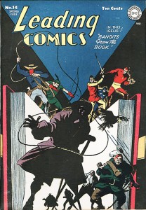
With volume three of the archive series, the final six Soldiers stories for nearly 30 years are presented. With Samachson becoming ever more adept at devising interesting plot twists and storylines, the artistic reins finally were handed to Argentinian Arturo Cazaneuve. While Cazaneuve was certainly no Mort Meskin or Pierce Rice, he was more than up to the task of a team book, even if he did give Sylvester Pemberton an incredibly bulbous cranium at certain points throughout his run. His brother, Luis, split cover duties with Jon Small, to varying degrees of success. Issue number 14, “The Bandits From the Books,” is probably the best of the series, a fun romp through some classic reads with unforgettable villains. The cover, by Small, is a minor masterpiece. As a bonus, a script by Samachson, scheduled for LEADING COMICS number 15, is included. Unfortunately, the super-hero market was waning in 1945 and only big names like Superman, Wonder Woman and Batman were able to maintain enough sales numbers to keep their titles afloat. Since the Seven Soldiers of Victory were made up of second-stringers, the decision was made to change LEADING COMICS to a “funny animal” book. As foreword writer, Roy Thomas, notes, the script finally got published in 1975, with artwork by some of DC’s most well-known names of the time.

So, my advice? Disengage your brain for a bit, take a trip back to a simpler time and check out the Seven Soldiers of Victory, gloriously reproduced in hardcover archive editions. You won’t be sorry. (DT)